

چاپ جعبه چای
Tea Box Printing: A Blend of Art and Functionality Tea box printing is a crucial aspect of packaging that combines aesthetics, branding, and practicality. The design and printing process must reflect the quality of the tea inside while ensuring durability, visual appeal, and compliance with industry standards. 1. Design Considerations The design of a tea box begins with understanding the brand identity and target audience. Elegant typography, soothing color palettes, and nature-inspired illustrations often dominate premium tea packaging. For herbal or flavored teas, vibrant hues and bold graphics may be used to highlight unique ingredients. The design must also include essential information such as tea type, origin, brewing instructions, and certifications (organic, fair trade, etc.). 2. Material Selection Tea boxes are typically made from high-quality paperboard, corrugated cardboard, or eco-friendly materials like recycled paper or biodegradable options. The choice depends on the product’s positioning—luxury teas may use textured or foil-stamped finishes, while everyday teas prioritize cost-effective yet sturdy materials. Lamination or UV coating is often applied to protect against moisture and enhance visual appeal. 3. Printing Techniques Advanced printing methods ensure precision and vibrancy: - Offset Printing: Ideal for intricate designs and large batches, offering sharp details and consistent color reproduction. - Digital Printing: Suitable for small runs or customizable packaging, allowing quick adjustments without high setup costs. - Flexography: Used for simpler designs on flexible materials, often for mass-produced tea bags or outer cartons. Special effects like embossing, debossing, or metallic inks can elevate the packaging, making it stand out on shelves. 4. Sustainability in Printing With growing environmental awareness, many brands opt for soy-based inks, water-based coatings, and FSC-certified paper. Minimalist designs with reduced ink coverage also align with eco-friendly goals. Reusable or recyclable packaging further enhances a brand’s sustainability credentials. 5. Functional Aspects Beyond aesthetics, tea boxes must protect the product from light, air, and moisture. Inner linings, such as foil or food-grade plastic, preserve freshness. Structural design—like easy-open lids or resealable features—improves user convenience. Conclusion Tea box printing is a meticulous process where creativity meets functionality. From design conceptualization to material selection and printing execution, every step influences the consumer’s perception and the product’s market success. A well-crafted tea box not only safeguards the tea but also tells a story, inviting customers to experience the blend within. By balancing visual appeal, durability, and sustainability, tea box printing becomes an art form that enhances both brand value and customer satisfaction.
تولید - محصول
طبقه بندی:
-

جعبه بسته بندی چای سیاه فوری Sanrong
دسته بندی: جعبه چایبازدیدها: 1062شماره سریال:زمان انتشار: 2025-09-27 14:04:16طراحی این جعبه بسته بندی چای سیاه فوری، جشنی برای چشم و لمس است، و ماهرانه جوهر گرم چای را به یک زبان طراحی مدرن و مد روز ترجمه می کند. این فقط یک ظرف نیست، بلکه یک پل احساسی است که محصول را به مصرف کنندگانش متصل می کند. بسته بندی رنگ قرمز پر جنب و جوش و پر جنب و جوش را به عنوان رنگ اصلی خود انتخاب می کند - یک رنگ استراتژیک انتخاب شده است. این قرمز یک قرمز روشن استاندارد نیست، بلکه یک سرخابی گرم است که یادآور مشروب چای سیاه بالغ است. این آتشین و درخشان است و فوراً در قفسه های فروشگاه خودنمایی می کند. در روانشناسی رنگ، قرمز مستقیماً انرژی، اشتیاق و گرما را برمی انگیزد – کاملاً با تجربه آرامش بخش و نیروبخش چای سیاه مطابقت دارد. در نگاه اول، مصرف کنندگان به طور شهودی سرزندگی و گرمای محصول را حس می کنند و پایه احساسی مثبت و شادی را ایجاد می کنند. دستیابی به این بافت استثنایی به هم افزایی دو تکنیک پیچیده بستگی دارد. نقش برجسته به طرز هنرمندانه ای روی لوگوی برند و نقوش مرکزی اعمال می شود. این عناصر از طریق قالب گیری دقیق، الگوهای برجسته برجسته ای را بر روی سطح کاغذ تشکیل می دهند و لایه های بعدی ظریفی را ایجاد می کنند. یک لمس ملایم برجستگیهای متمایز را نشان میدهد، جایی که این تجربه لمسی - فراتر از دید صرف - به طور قابل توجهی پیچیدگی و تعامل بستهبندی را ارتقا میدهد و بیصدا تعهد برند را به جزئیات نشان میدهد. به طور همزمان، فناوری نانو پوشش در سراسر سطح جعبه اعمال می شود. این فیلم محافظ فوقالعاده شفاف، بافتی فوقالعاده صاف و شبیه به پوست ایجاد میکند – شبیه به لمس ابریشم ظریف. این نه تنها راحتی حمل و نقل را افزایش می دهد، بلکه عملکرد عملی را نیز ارائه می دهد، در برابر خراش ها و لکه ها مقاومت می کند تا اطمینان حاصل شود که محصول در سراسر توزیع و نمایش بکر باقی می ماند. تاج تاج، بافت منحصر به فرد و روان جعبه آب مانند است. این الگوها خطوط سفت و سخت نیستند، بلکه منحنی های سینوسی و به طور طبیعی جریان دارند که شبیه برگ های چای هستند که به آرامی در آب داغ باز می شوند و می رقصند. مانند لحظات یخ زده چای در حال حرکت، بسته بندی ثابت را با ریتمی پویا و حس سرزندگی القا می کنند. این نمایش هنری فرآیند دم کردن نه تنها تخیل مصرف کننده را راهنمایی می کند، بلکه جلوه های نور و سایه غنی را تحت نورهای مختلف ایجاد می کند و در نتیجه ظاهری عمیق و فریبنده از نظر بصری ایجاد می کند. در انتقال اطلاعات، طرح به تعادل هماهنگی از وضوح و زیبایی شناسی دست می یابد. نام تجاری و اطلاعات اصلی محصول - "چای سیاه فوری" - با حروف تمیز و مدرن ارائه شده است که در نقطه کانونی بصری بسته بندی قرار گرفته است و از تشخیص فوری جزئیات کلیدی اطمینان می دهد. همه عناصر متنی و گرافیکی به دقت چیده شدهاند تا با بافت آب روان و پسزمینه قرمز همزیستی هماهنگ داشته باشند و ترکیب بصری منسجمی را تشکیل دهند. طراحی کلی با موفقیت سرزندگی برند، راحتی محصولات فوری و گرمای ذاتی چای سیاه را در یک هویت بصری تصفیه شده، مد روز و پویا ادغام می کند. این به طور دقیق اطلاعات محصول را منتقل می کند و در عین حال زیبایی هنری را به بسته بندی می بخشد، و کاملاً با پیگیری دوگانه مصرف کنندگان جوان مدرن برای "جذابیت زیبایی شناختی" و کیفیت هماهنگ است. این امر آن را در یک بازار رقابتی بسیار جذاب می کند. -
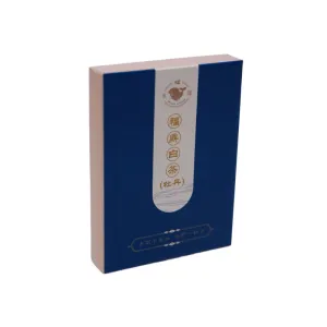
جعبه بسته بندی چای سفید فودینگ
دسته بندی: جعبه چایبازدیدها: 880شماره سریال:زمان انتشار: 2025-09-28 14:26:38این جعبه بسته بندی چای سفید فودینگ تکنیک های چاپ مبتکرانه را با زبان طراحی مینیمالیستی و ظریف ترکیب می کند تا ظرفی را ایجاد کند که به طور هماهنگ جذابیت بصری را با هویت برند ترکیب می کند. طراحی با استفاده از نقش برجسته، برجسته کردن، و مهر زنی فویل، تجربه لمسی را غنی می کند و در عین حال کیفیت استثنایی را در تمام جزئیات به نمایش می گذارد. نقش برجسته به سطح کاغذ بافت ظریفی می بخشد، که یادآور آثار باقی مانده از چای سفید در طول زمان است. برجسته کردن باعث می شود که الگوها و متن سه بعدی به نظر برسند و تقریباً در لمس قابل لمس باشند. مهر و موم فویل، لمسی از درخشندگی درخشان میافزاید و طرح کلی را با فضایی از پیچیدگی روشن میکند. این بسته بندی رنگ آبی عمیق و آرام را به عنوان رنگ اصلی خود انتخاب می کند - که وسعت آسمان شب در هنگام غروب یا اعماق آرام یک دریاچه ساکن را تداعی می کند - حس آرامش و پیچیدگی را منتقل می کند. این انتخاب رنگ نه تنها بافت بسته بندی را افزایش می دهد، بلکه به طرز ماهرانه ای با ظرافت کم رنگ چای سفید هماهنگ می شود. روی جعبه به طور ظریفی با صورتی ملایم، مانند درخشش ملایم اولین نور سپیده دم، برجسته شده است. این یک تضاد قابل توجه و در عین حال هماهنگ با پایه آبی عمیق ایجاد می کند، و یکنواختی را که یک تن ممکن است ایجاد کند، می شکند و در عین حال یک افکت لایه ای روشن را اضافه می کند. احساس طراوت و سرزندگی است که از آرامش بیرون می آید. در جلوی جعبه، یک نوار تزئینی سفید خالص به صورت افقی کشیده شده است که محدودیت شاعرانه فضای منفی را در یک نقاشی تداعی می کند. با دقت روی باند الگوها و متنهایی به سبک سنتی چاپ شده است. این الگوها دارای خطوط روان و فرمهای زیبا هستند - خواه شاخههای چای را باز کنند یا نقوش ابری چرخان - که جذابیت شرقی غنی را به نمایش میگذارند. چیدمان متن منظم و ساختار یافته است و از فونت های Song یا Kai با خط های خوشنویسی استفاده می کند. این ترکیب ظرافت کلاسیک را با حفظ خوانایی مدرن به تصویر می کشد. در زیر نوار تزئینی سفید، ردیفی از کاراکترهای کوچک که با فویل طلایی چاپ شده است خودنمایی می کند. ظریف و تصفیه شده، شبیه ستاره هایی هستند که در آسمان شب آبی عمیق پراکنده شده اند و کنتراست درخشانی را در پس زمینه ایجاد می کنند. این نه تنها تمرکز بصری را جلب می کند، بلکه متمایز بودن برند را نیز بیشتر می کند. طراحی کلی به تعادل کامل بین سادگی و ظرافت دست می یابد. خطوط تمیز و ساختارهای هندسی به بسته بندی طراوت مدرن و واضح می بخشد، در حالی که تضادهای رنگی، الگوهای پیچیده و تکنیک هایی مانند مهر زدن با فویل به طور جمعی هاله ای کم رنگ و در عین حال تصفیه شده و مجلل را پرورش می دهند. این فلسفه طراحی نه تنها با ویژگیهای ذاتی چای سفید -طعم خالص، لطیف و مزه ماندگار آن- هماهنگ است، بلکه از طریق زبان بصری سبک زندگی آرامش، راحتی و کیفیت بالا را به شما منتقل میکند. با گرفتن آن در دستان خود، بررسی الگوهای آن و لمس آرام شکل آن، تقریباً می توانید عطر چای را که در هوا پخش می شود احساس کنید و در حین انجام این کار ذهن خود را آرام می کند.


اخبار
طبقه بندی:
هنوز هیچ نتیجه جستجویی وجود ندارد!
مورد
طبقه بندی:
هنوز هیچ نتیجه جستجویی وجود ندارد!
ویدئو
طبقه بندی:
هنوز هیچ نتیجه جستجویی وجود ندارد!
دانلود
طبقه بندی:
هنوز هیچ نتیجه جستجویی وجود ندارد!
استخدام
طبقه بندی:
هنوز هیچ نتیجه جستجویی وجود ندارد!
محصولات پیشنهادی
هنوز هیچ نتیجه جستجویی وجود ندارد!


 تلفن
تلفن